A new face for Quiki
The app you log into today does not look like the one you logged into a month ago. Same engine underneath. Different skin, different bones in places, a lot more breathing room.
Here is what changed and why.
Why bother
The first version of Quiki was built fast, in dark teal and pumpkin orange, optimised for "does this even work yet". It did work. People used it. And after enough sessions in a row I started to feel the rough edges. The dashboard had three different ideas of what a card should look like. The video page was an 800-line file with five tabs nobody asked for. Light mode was an afterthought. The bulk import modal opened like a contract.
So I sat down with the actual usage patterns and rebuilt.
What is new
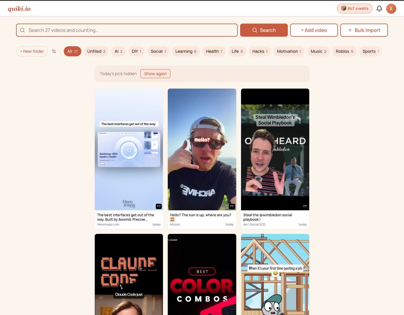
A magazine-style video page. Open a scanned video now and you get one tall layout: thumbnail, title, the AI take, transcript, related videos. No tab roulette. The action stack lives on the right where your eyes expect it.
A consistent shell. Every page shares the same top bar and footer now. Settings, Activity, FAQ, the legal pages, even the admin views. You always know where you are in the app.
Cream and terracotta. The new palette is warm cream backgrounds, soft terracotta accents, plenty of whitespace. Dark mode kept its bones but lost the cold blue. Both themes use the same design tokens, so a new screen does not mean redrawing the wheel.
A real Activity page. The old one was a flat list. The new one groups by date, lets you filter on scan type, and paginates ten at a time. It is finally usable as a memory of what you have done.
A new Account page. Seven sections, deep links to each, a mobile pill nav up top. Billing history reads "Fast scan", "Transcript scan", "Deep scan" instead of pretending every charge
was the same thing.
A bulk import modal that does not feel like paperwork. The old one was a 1,268-line file with three columns of instructions. The new one fits on a phone, hides the help text behind a disclosure, and lets you swap a wrong file without starting over.
A Folders strip with an Unfiled pill. Anything the AI could not categorise lands in Unfiled, and now there is a one-click view for it sitting right next to All.
What did not change
Your library. Your folders. Your credits. None of this touched the database. Anyone who logged in before the redesign and again after found their videos exactly where they left them.
What is still cooking
A holistic dashboard refresh that ties the new chrome together with a smarter landing view. And five email templates that have not yet been restyled to the new brand. They will catch up.
Got feedback? Drop us a line on the contact page.
Your saved videos miss you. Go find them.
Join the creators, marketers, and agencies using Quiki.io to organize their video hoard.